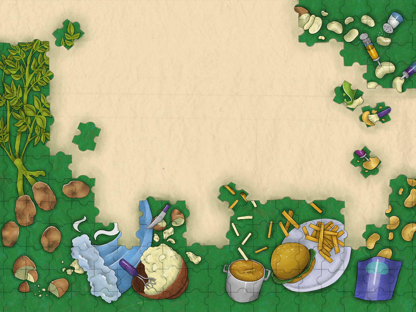
Unprocessed Vs. Processed
An interior illustration that also serves as an infographic for the sliding scale of processed food. From whole potatoes, to minimal preparation (mashed potatoes), to more processed (french fries), to potato flavoring/coloring with no natural potato (chips).
Progress
I really wanted to highlight the differences between whole foods and processed foods in a way that is easy to understand, so I liked the idea of having one side of the spread being items that came straight out of the ground and the other half being items like fast food, which oftentimes have an extreme amount of chemicals and preservatives.
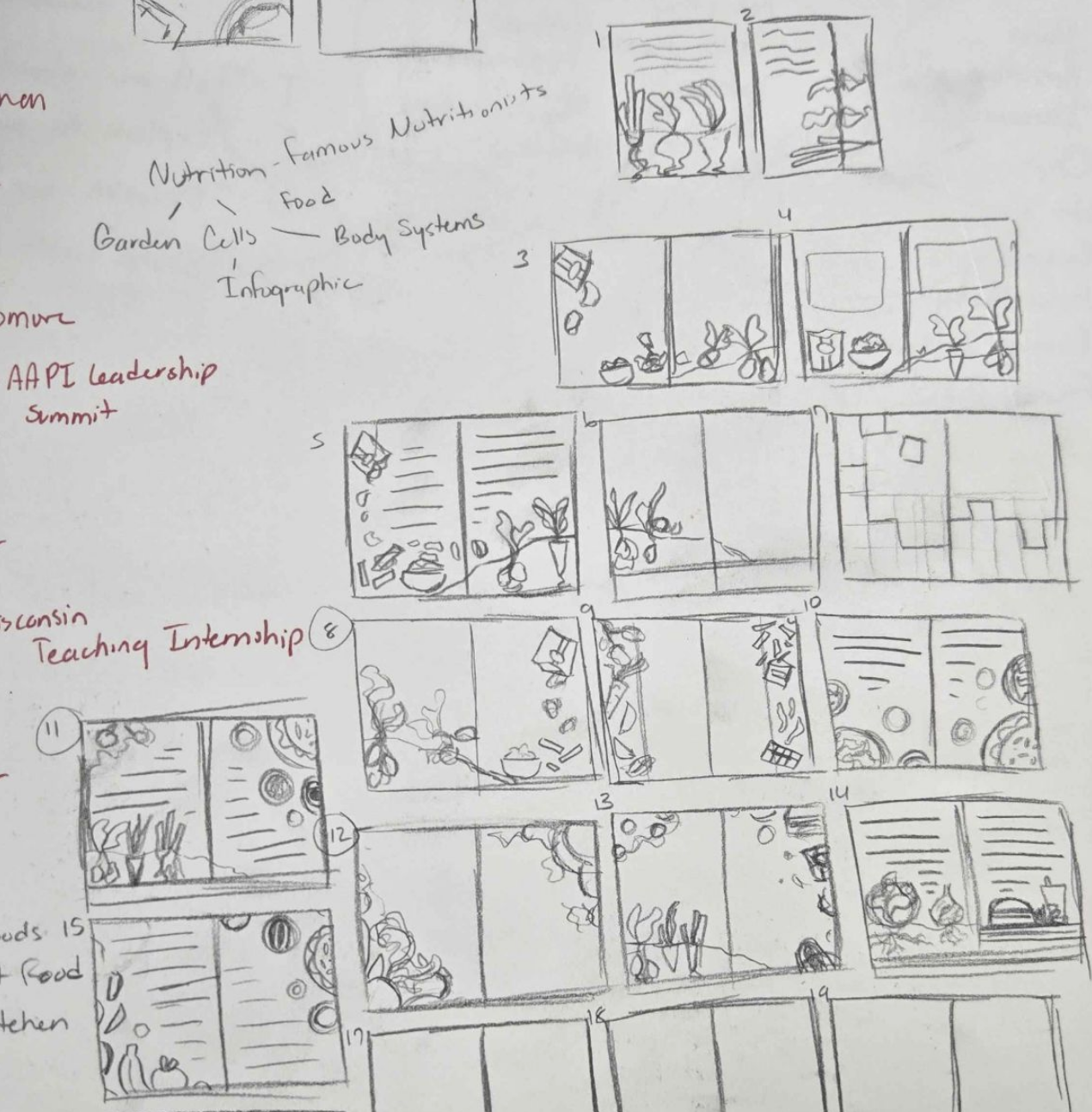
These are the thumbnails I ended up presenting in class. We went with numbers 2 and 3 to move on with.

Some rough sketches! I really liked both of these for different reasons, but when we applied text to the second one, it was a bit harder to read than the first. We also chose the first because not only did it highlight the difference between processed and unprocessed food, but it also showcased the degrees in which the same ingredient- in this case a potato- can be processed.

Color studies! I knew I wanted a light-to-medium key to keep the energy of the illustration up. Number 3 felt right in that aspect, as it was fun and bright, the yellow-greens giving it a semi-healthy feel.

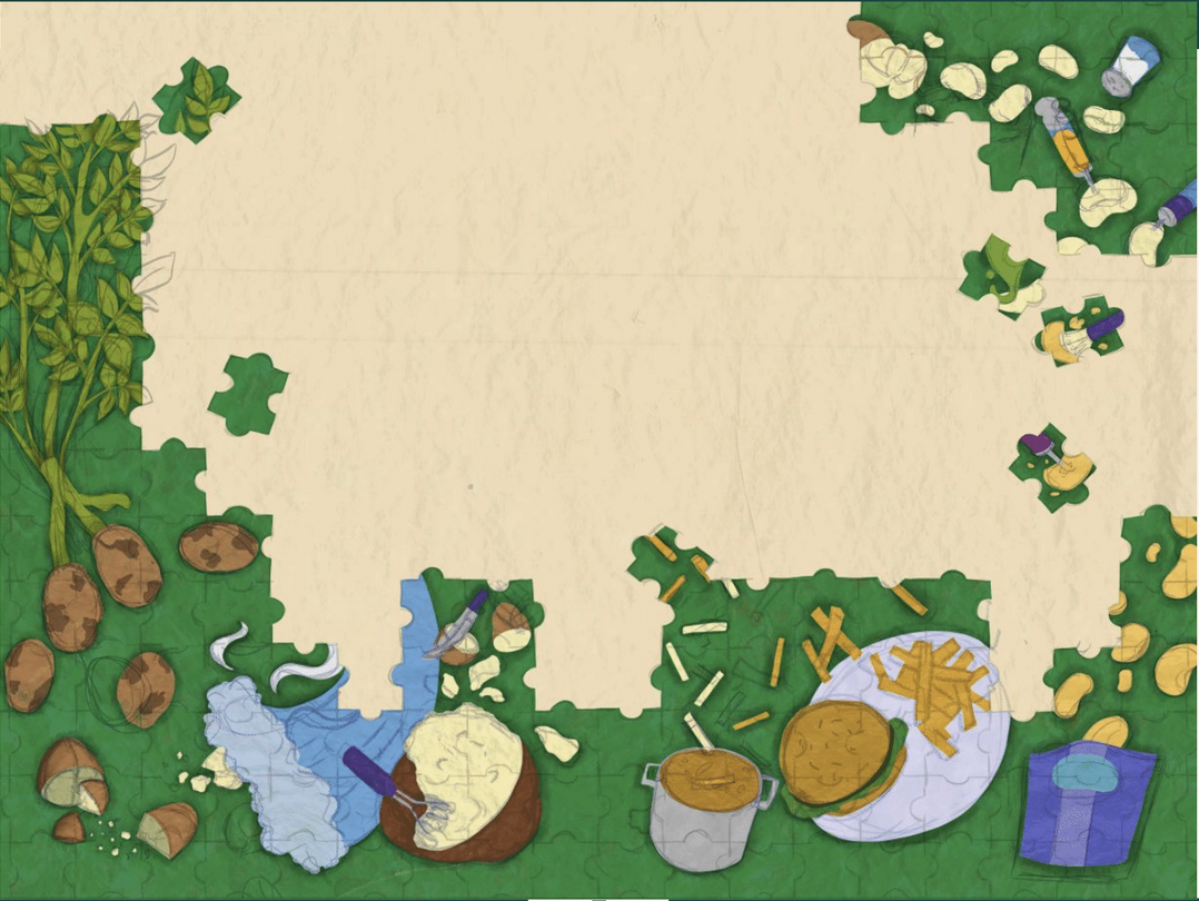
Work in progress image!
Final Image!